Communicating variation in prescribing - Why We Use Deciles
- Authors:
-
Posted:
- Categories:

On OpenPrescribing.net we provide data for individual practices and CCGs (and now STPs and regions!) making it easier for everyone to explore NHS prescribing patterns in England - supporting safer, more efficient prescribing. However, providing data for an individual location in isolation is rarely useful. We need to provide context, so that some sort of judgement can be made about whether the prescribing in question is especially high or low, and how extreme it is, in comparison with others. On OpenPrescribing we do this using deciles. We think providing transparency in our methods is really important, so in this blog I set out our rationale for doing so.
Where do you start?
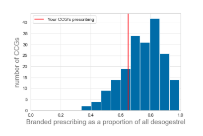
When presenting data in a visual manner a good start is to show the data in comparison with the average (mean or median) prescribing. However, it’s also important to give an impression of how spread out the behaviour is, so that users can get an impression of how typical or unusual their prescribing is. One way to do this - for a fixed point in time - would be to draw a histogram (figure 1).
Figure 1: A histogram illustrating one method of showing how the prescribing of a given practice or CCG compares to its peers.
However, there is also great value in showing how prescribing has changed over time because it shows the trends occurring in the data. Having a histogram for each month in the last 5 years wouldn’t work at all.
Why do we use deciles?
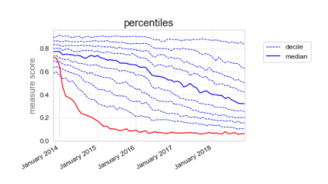
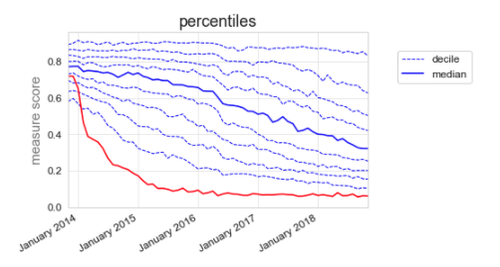
In the early days of OpenPrescribing we spent a lot of time thinking carefully about how to present the data to GPs, pharmacists, patients and everyone. The method we settled on, which is still the method we use today is plotting the median, along with deciles; for example, our desogestrel measure (figure 2). This way, the CCG can see that their prescribing (red line) used to be slightly below average at the end of 2013, but they have dramatically reduced their proportion of branded prescribing, and are now well within the best 10%.
Figure 2: Total quantity of branded desogestrel as a proportion of total quantity of all desogestrel.
We chose deciles because:
- They are easy to understand, compared to the alternative options.
- They show, at a glance, how a practice or CCG is changing in relation to their peers.
- They give an impression of how spread out behaviour is, and how that’s changed over time.
- They show when a specific subgroup of practices/CCGs changes, while others stay static.
What are the alternatives?
We’ve previously investigated using other methods of describing variation in prescribing. Traditionally, one might describe the level of variation using the standard deviation. In simpler terms, the standard deviation is a measure of the typical distance that individuals are away from the average (mean) value.
For example, the standard deviation of desogestrel measure (figure 2) is 13% at the start of the graph, where the deciles are closely grouped, and 26% at the end of the graph, where they are much more spread out.
This might be viewed in some ways as more statistically robust. Using the standard deviation will give an impression of how far away from typical prescribing a practice/CCG is, while taking into account the level of variation. In contrast, deciles only tell you where a practice/CCG ranks in relation to other practices. Each practice/CCG can be given a value to describe how many standard deviations they are away from the mean. This is also known as a z-score, and it would in theory allow more direct comparisons to be made between the different measures on OpenPrescribing.
Why don’t we use z-scores?
There are two reasons why we don’t use z-scores. Firstly:
They’re more difficult to understand. We think that: “Your practice is in the highest 10%” is a powerful and intuitive message, whereas “Your practice is 2.3 standard deviations above the mean” is much more abstract.
Our two pharmacists, Rich and Brian, who routinely discuss prescribing patterns with GPs and other NHS staff, explain:
“If it takes Alex 1,300 words to explain z-scores…… how the hell do you think I can explain the concept in the 2 minutes I may have someone’s attention for in a busy general practice?”
Secondly and possibly more importantly:
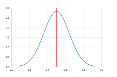
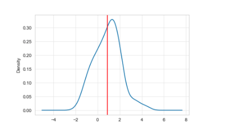
There’s a statistical problem. If you’ve ever done a course on stats, you may remember lots of discussion about the importance of the normal distribution. It looks like figure 3, where the red line is the mean.
Figure 3: Normal distribution
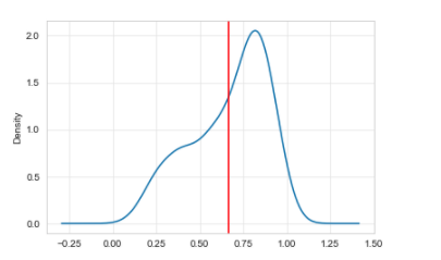
You may also have come across a “skewed” distribution. For example, the distribution in January 2015 for the desogestrel measure is shown in Figure 4.
Figure 4: A left skewed distribution, where the mean value is shifted left because of a minority of practices
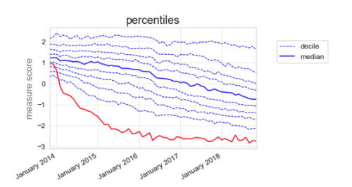
You can also see that it is skewed in the deciles (figure 5).
Figure 5: Total quantity of branded desogestrel as a proportion of total quantity of all desogestrel illustrated using deciles.
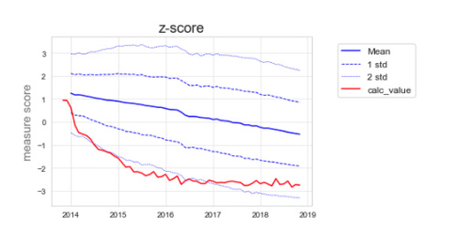
If we try to use the standard deviation to describe the variation over time, there is an inherent assumption that the variation is equal on either side of the mean, when in this case it obviously isn’t. Figure 6 illustrates how the graph would look if we used z-scores.
Figure 6: Total quantity of branded desogestrel as a proportion of total quantity of all desogestrel using z-scores.
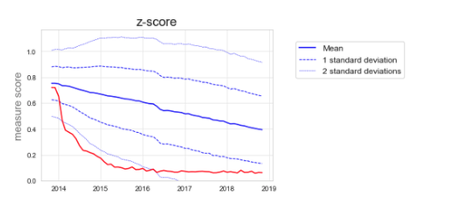
You will see that figure 6 does not represent the full picture. Looking at the deciles in figure 5, we see that to start with, a minority of CCGs start to change, followed by many more CCGs, while some CCGs are left behind with very high branded prescribing. In figure 6, we miss seeing this detail.
But what about transformations?
The nerdiest amongst you might point out that you can make the data normal, by performing a transformation on it. You are correct. Without a transformation, the z-scores of a skewed distribution are not valid as a measure, because the data break the assumption of normality. Without the transformation, a z-score of 1 and -1 would relate to very different levels of extremity
As this measure is a proportion, the appropriate transformation in this case, would be a logit transformation. This turns the skewed distribution above, into a pretty normal distribution (figure 7).
Figure 7: Logit transformed version of figure 4.
This transformation also “evens out” the distribution of the deciles fairly well (figure 8).
Figure 8: Logit transformed version of figure 5.
And for completeness, the transformed z-score graph (figure 9).
Figure 9: Logit transformed version of figure 6.
The transformation also further reduces how intuitive the measure is: the numbers along the Y-axis for the measure score are now more or less meaningless, rather than being an easy to understand proportion/percentage. Although the transformed data no longer break the assumption that the data are normal, the fact that the data are skewed is itself interesting, and the very act of transformation removes that important nuance.
Transforming in this way also doesn’t work very well for all our measures because of an even nerdier set of problems, relating to zero-inflated, bimodal distributions, but that will have to wait for another blog.
So what?
The more in depth statistical approach has some merit and we’ll continue to explore this and other options for analysing the data; but in terms of displaying data on OpenPrescribing, we think deciles are the best option for now. At the Bennett Institute we think open discussion of ideas and methods will help create better insights and eventually support better outcomes for patients. If you disagree with anything we have said or think there is an even better way of presenting our data please get in touch at bennett@phc.ox.ac.uk.
As always we need resource to do our work. We’d love to do more formal research on the best way to present data for health professionals, who are an interesting audience: somewhat lay, in terms of stats, and somewhat informed. If you’ve got resource to help us hire and ship even more applied research - or if you’d like to work on these questions and your time is already funded - then as ever: get in touch!
More in OpenPrescribing

Improvement Radar: A new OpenPrescribing tool to identify best practice
9 Apr, 2024
STAR-PUs - should we still be using them?
27 Feb, 2024
OpenPrescribing Winter 2023/2024 Newsletter
21 Feb, 2024
Spot the difference. Part 2: Analytic Choices
29 Jan, 2024
Spot the difference. Part 1: Source Datasets
29 Jan, 2024
What makes a good OpenPrescribing measure?
4 Dec, 2023